It was madness
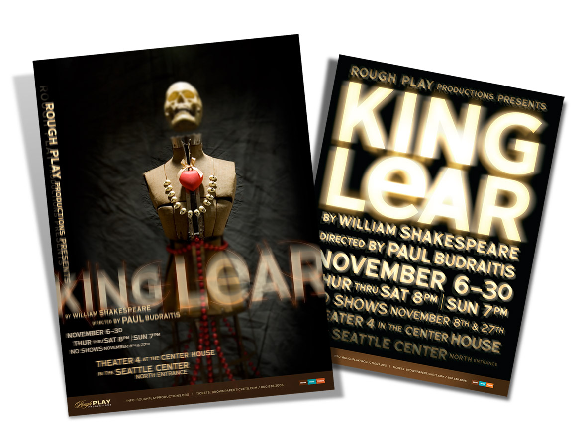
When Rough Play Productions asked me to design a poster for an avante-garde production of King Lear, I said “Though this be madness, yet there is method in it.” (I know, Hamlet.) The director used bright lighting in a completely black room — often directed into the eyes of the audience — as a part of the production concept. Utilizing stuff we happen to have lying around the house, an antique dress form and a plastic skull — plus some playful typography — I created this equally mad photo-illustration to illustrate the overlaying themes of the classic Shakespeare play. I was having so much fun with it that we created a second concept, which was all about the lighting effects.

I’m pleased to report that the skull version received a gold award in the Graphis Poster Annual 2010 competition, and also appeared in the Graphis Design Annual 2010. Plus! I was one of the 1,100 lucky winners to appear in the book, Presenting Shakespeare, 1,100 Posters from Around the World, curated by Mirko Ilić & Steven Heller.

